Top 10 Album Covers on Roadrunner
http://www.youtube.com/watch?v=SNbUSSKmRek
. . .
Roadrunner’s site is counting down the 10 greatest album covers in the label’s history, as voted on by its staff. This is interesting, as Roadrunner is hardly what one thinks of now when it comes to artwork or even metal. But back in the day, Roadrunner had some iconic metal records with iconic metal artwork. In the above video, Roadrunner A&R head Monte Conner discusses the #10 pick. What he says is well worth hearing, especially regarding the difference between artwork then and now.
Below are my top 10 picks for Roadrunner’s best ever album covers. They are not my picks for Roadrunner’s best ever records. I like these records to various degrees, but all their covers are frame-worthy for me.
What would be yours?
(If you need to jog your memory, unfortunately there’s not much out there to help. Discogs.com has a terribly disorganized discography for Roadrunner that includes all its foreign subsidiaries, which often sign non-metal acts. You can also try slogging through Roadrunner’s releases page; the bottom right box offers a very incomplete discography. You’d think that a label could just list its damn catalogue somewhere.)
. . .
10. Suffocation – Effigy of the Forgotten (1991)

This painting is sort of a combination of Japanese mecha, H.R. Giger’s Alien, and Dan Seagrave’s trademark intricacy. I still see new things in it whenever I look at it. Recently in the bottom center, I noticed the small creature which could be the predecessor for Devourment’s maggot mascot. Incidentally, Seagrave did the maggot for Devourment’s latest album cover.
. . .
9. Annihilator – Alice in Hell (1989)

There’s something off about Len Rooney‘s artwork for Alice in Hell. The perspective isn’t right, or the angles are wrong, or…something. But the skewed nature of the piece absolutely works. It perfectly nails the vibe of ’80s horror movies, which often involved evil dolls and home invasions. If you went into a video store in the ’80s, the horror section looked like this.
. . .
8. Sepultura – Beneath the Remains (1989)

Michael Whelan could have had multiple appearances in this list, including Sepultura’s Chaos A.D. and Obituary’s Cause of Death. But while Chaos A.D.‘s cover offers more things to look at (it has the “underground caverns of dirty technology” vibe of late-’80s video games like Contra and Metroid), Beneath the Remains shows that less is more. The skull, the roses, the wisps of smoke — it’s all perfect, as is the typography on the right.
. . .
7. Biohazard – Urban Discipline (1992)

This was the first album that came to mind for this list. As pure art, it’s not particularly great — an awkward collage of a death metal sky with a hardcore punk photograph. But as a cultural artifact, it’s amazing. This album came out when racial tensions in America were sky-high (the LA riots occurred the same year), and gangster rap albums were practically racial war set to James Brown loops. (The cover of N.W.A.’s Efil4zaggin comes to mind.) Also, having lived in Brooklyn, I can say that much of it looks like this.
. . .
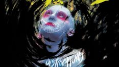
6. Nailbomb – Point Blank (1994)
![]()
You could spot this from a mile away in record store racks. Simple, brutal, and effective.
. . .
5. Fear Factory – Demanufacture (1995)

Few album covers sum up a band’s ethos so well. As Kraftwerk said, “Man Machine: pseudo human being / Man Machine: super human being”. Dave McKean’s mesmerizing artwork for Disincarnate’s Dreams of the Carrion Kind could also have made this list. He did covers for many big ’90s albums, metal or not; you can see them here.
. . .
4. Obituary – Slowly We Rot (1989)

This cover is deceptive. From a distance, it looks like a simple splash of slime. But up close, it reveals details: a slowly rotting figure with rats on the way. The putrid vibe is perfect for the heaviest album ever recorded in standard tuning. I wish I could find out more about cover artist Rob Mayworth. Evidently he designed the Obituary logo — another fantastic work of art — but that’s all I know.
. . .
3. Deicide – Legion (1992)

Deicide’s album artwork tends to be either awesome or awful. The S/T cover is a classic, and I seriously considered Insineratehymn for this list, as its logo is one of metal’s most recognizable, up there with Venom’s pentagram or Nile’s ankh. But Legion wins for its air of mystery. What’s that red glow in the middle? What’s that symbol, exactly? The decision to make it spherical instead of 2-D was brilliant. It’s almost like a face.
. . .
2. Type O Negative – Bloody Kisses (1993)

I actually detest this album cover. Girl-on-girl action is never a bad thing, but I’m just not feeling the hairdo of the one on the left. Superficial preferences aside, this record was another one that practically screamed at you from the CD bin. Strong and simple is the way to go. If Monte Conner has a house, this cover probably bought it for him.
. . .
1. Mercyful Fate – Don’t Break the Oath (1984)

This one wins by a country mile. Yellow is not a common color on metal album covers, but it’s also the “loudest” one. Combine that with a hand breaking the plane into the very depths of your soul — I Want YOU (to “Come to the Sabbath”) — and you have perhaps the best heavy metal album cover ever made.
. . .