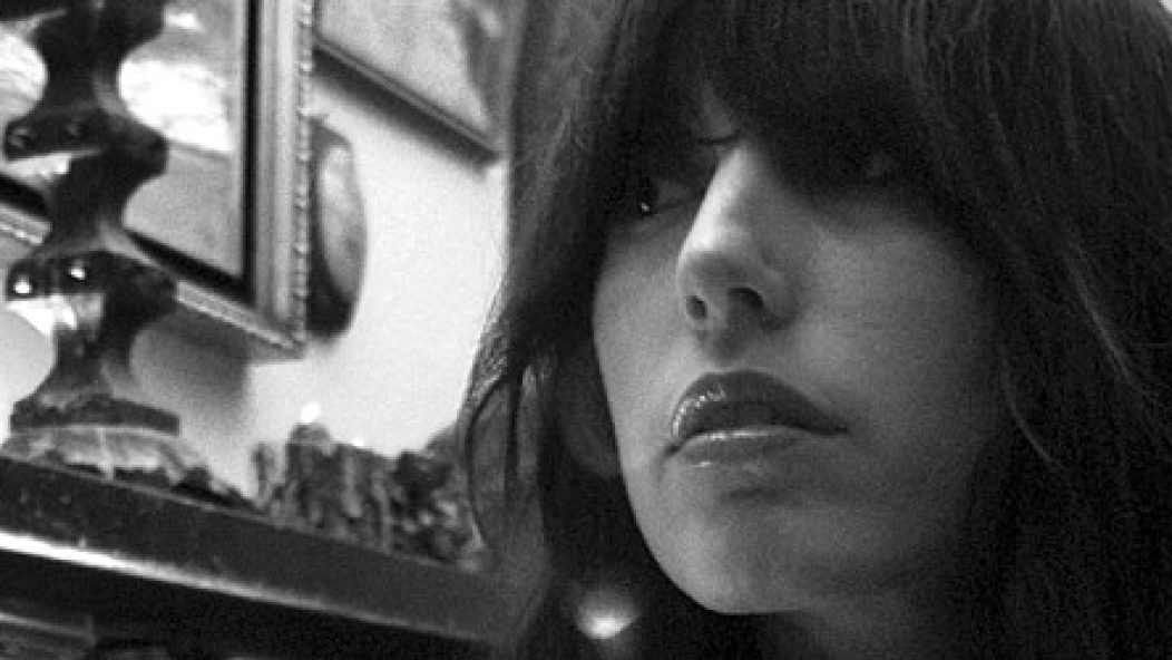
Interview: Sera Timms

. . .
Sera Timms has style. This is clear when I see her band Black Math Horseman play. Not many singers step on pedals with knee-high boots. Nor do they wear big, flouncy skirts or play rare Swedish (Hagström) electric basses. Low light, fog, and menacing bangs seal the deal. Joey Ramone would be jealous.
Timms runs a design company called Deer and Unicorn. She’s done all sorts of work, from album artwork to web design to directing videos for Isis and Intronaut. Many technicians do these things, but few can be called artists. Being an artist requires individual style. Timms has that in spades. Her work has several, instantly recognizable threads: darkness, mystery, and a love for older aesthetics. She can make a flyer for dogwalking look interesting. In this email interview, she reveals some of her secrets – but as always, not all of them.
. . .
Walk us through your visual history. When did you first start seeing things you liked? What were those things? How did you move from being an observer to a creator?
I would say that as early as nine or so, I was seduced by aesthetics in that I decided I wanted to be a ballet dancer, which was in large part because of how beautiful and graceful it looked to me, down to the last detail of the costumes. Another of my few early visual memories is of being underwater in the neighborhood pool with my eyes open and secretly watching all the peaceful legs and torsos drifting around.
I grew up in the coastal mountains of Northern California, so I was constantly surrounded by nature. And no matter how beautiful a manmade work of art may ever be, I don’t think man can ever outdo nature as far as aesthetic beauty is concerned – which leads to my moving from an observer to a creator through photography. My mom is an excellent photographer and always took a camera on day trips and camping, and eventually I started borrowing her camera and taking lots of flower pictures! I still take tons of flower pictures…it’s a ridiculous addiction.
. . .

. . .
You’re attracted to older aesthetics – antiquarian maps, silent movies, stop motion animation. How do these aesthetics speak to you? What do they offer to a generation furnished by IKEA?
The IKEA phenomenon is troubling! I do appreciate the original furniture that inspired the IKEA look, but I don’t appreciate quantity over quality. Which in part answers the first part of the question. Older objects and movies were made with more care, craftsmanship, and more human touch than new things generally are. Objects used to be unique – and even if they weren’t all that unique in their time, because they are now old, they have become unique in this time. I like to see the human handprint on objects and films…a bit of imperfection to show me there was a human behind it…not a machine, or even nature for that matter.
The fact that something looks old and dirty is attractive to me because I equate it with character. I guess I like objects and movies that have an aesthetic character all on their own. So in silent movies and especially in stop motion animation, the footage and movements themselves have an aesthetic character of their own that is completely separate from the narrative. Old film grain, flickers, dust, and scratches are like a movie’s skin. But as I’m saying these things, I realize that I never thought about these things before I was drawn to them – so this explanation comes after the initial attraction. I think it’s perhaps like trying to explain why you love one person and not another person. You can give reasons, but ultimately you don’t know where the attraction comes from. I am, however, quite guilty of glorifying the past.
I don’t know that these aesthetics offer anything to a generation furnished by IKEA. To be honest, I’ve never really thought about what I have to offer them. But now that I am, I would say that I hope that I offer them an alternative to the GMO monoculture they have been served up.
You use a lot of technology – Photoshop, video editing software – to achieve an older look in your work. Do you see tension or issues of inauthenticity with this?
Well, I’m very much guided by my gut, which for whatever reason wants to make everything look old. In that sense, I think that it is as authentic as possible, because when I’m making it, I am listening to my deepest desire and guidance and doing exactly what it tells me to do – which is authentic. If I were to start questioning and judging myself in the process of creating, I think that would kill my idea or make it impure. In fact, I would never ever complete anything if I were to ask myself those kinds of intellectual questions that didn’t fit onto my personal flow of creativity.
But if I step away and look at my work as a viewer, I would say that there could be a tension. My first “professional” video was the Isis video, which was actually shot on Super 8 [mm film]. Which was really very difficult, and I didn’t have as much control as I wanted, so I shot the Intronaut video on HDV [high-definition digital video]. The Intronaut video is far less grainy and dirty than the Isis video.
I don’t care if people actually think my work looks old or new. What’s important to me is that I convey a mood and an atmosphere. I actually think it’s a process of evolution that I’m going through, much like [how] film stocks evolved.
. . .
Isis – “Not in Rivers, But in Drops”
http://www.youtube.com/watch?v=rdtMkKaSmGs
. . .
Walk us through your thought processes for conceptualizing the Isis and Intronaut videos. Both bands’ songs have very minimal lyrics, and thus don’t offer much guidance. Did the bands have any input in the process?
For the Isis video, I met up with [vocalist/guitarist] Aaron Turner, and he explained to me what his lyrics were inspired by, which was the story of Hassan-i Sabbah, as well as several visual artists and film directors he and the band were influenced by and liked. I then did lots of my own research on Hassan-i Sabbah so that I could feel totally immersed in the world that inspired the lyrics, and came up with my own symbolic visual narrative from that.
Aside from Aaron’s initial explanation, he had a few remarks after seeing my treatment – specifically about wanting to make sure there were parts of the video that were not specifically character-driven and were more atmospheric/environmental. Other than that, I was allowed total creative freedom, which was great.
With the Intronaut video, [vocalist/guitarist] Sacha Dunable gave me a simple explanation of the lyrics, which I will just say included alcohol. I then researched alcohol back to alchemy and came up with my treatment from that. Once again, I was given total creative freedom on this one once my treatment was approved.
. . .

. . .
The visual concept for Black Math Horseman’s Wyllt revolves around knights. A knight’s armored hand appears in the Isis video. Coincidence? What is the draw for you of the theme of the knight?
I just love armor! Just as I love old things. It’s so aesthetically beautiful and well crafted, with fine, delicate detail and beautiful engraving – and yet its purpose is to protect a fragile human life in a bloody battle! I think it combines the feminine and the masculine so very well. Also, I love the idea of chivalry, though it is my own romantic version of it… I certainly would not have wanted to be a woman in that time period.
I get a Jan Švankmajer vibe from the Intronaut video, and also a Tool video vibe – or maybe Tool is referencing Švankmajer. Am I off the mark?
You are right on the mark! I believe that early Tool videos are influenced by Švankmajer, but even more so by Brothers Quay – all three of which I am a fan of.
. . .
Intronaut – “Australopithecus”
. . .
“Less is more”. Discuss.
In the Western world today, we are constantly bombarded by “more”! We truly live in an era of quantity over quality, and every day there are more buildings, people, objects, media outlets, and windows popping up all over the place telling you what to think, what to do, what to watch – basically telling you how they think you should be a human being on this planet. I want less! When there is less being thrown at you or shown to you, there is more time and space left inside of you to reflect, to contemplate, and to experience your own unique humanity. “More” is confinement, “less” is freedom.
You’ve designed DVD menus for major film studios. Your style is absent from those pieces. Are they strictly bill-payers? If so, is it possible to bring any part of yourself to the process?
When I first discovered I could get hired for those types of jobs, it was an interesting and exciting challenge to fit myself into that box, because I’d never been there before. I quickly realized that like most corporate boxes, it was black and claustrophobic inside, so I have avoided them for quite some time now.
You are given an unlimited budget and an automatic green light everywhere, but only for one month. What project, visual or otherwise, would you undertake?
That’s an easy one, actually. I would go straight into production of the Black Math Horseman “Tyrant” video treatment I wrote up and was unable to secure the funds needed to move forward.
Black Math Horseman – “Tyrant”
[audio: BLACKMATHHORSEMAN_TYRANT.mp3]
What projects are you working on now?
Background projections for live Black Math Horseman shows and handmade packaging for a limited edition Ides of Gemini release. We’re writing the next Black Math Horseman album, and I’m working on my two side music projects Ides of Gemini and Give Her the Gun.
. . .
Ides of Gemini
Give Her the Gun
Black Math Horseman
Deer and Unicorn (design, video direction, photo, fine art)
. . .