Interview: Kim Larson's "Dark Art: A Tribute to Metal"

. . .
San Francisco artist Kim Larson co-opened her gallery, Modern Eden, with fellow artist Bradley Platz in 2010. Located on a quiet street just north of the city’s North Beach neighborhood, Modern Eden’s open, airy atmosphere doesn’t prepare you for the dark, twisted work featured in the gallery’s latest show.
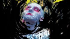
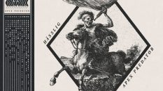
“Dark Art: A Tribute to Metal” gathers paintings, sculptures, and more from 31 San Francisco Bay Area artists. The work ranges from psychedelic-hued skulls to thrones that look like they’ve been lacquered in blood.
Larson paints and creates jewelry inspired by octopuses and other sea creatures, while Platz’s work is simultaneously surreal, unnerving, and classical. “We like strong, classical techniques but with an edge or twist that intrigue and get the viewer to think,” Larson says.
I interviewed Larson about “Dark Art” – how the show came to be, what inspired some of its most remarkable pieces, and the imagery many associate with metal culture. The show runs through September 9. Catch it if you can.
. . .
Where did the idea for the “Dark Art” exhibit come from?
As most of our show ideas come about, Bradley and I sit down and think about something that is interesting to us and different from our past exhibits. Also, our featured artist this month, Cory Benhatzel, is a huge metal fan and we like to coordinate show ideas since they are sharing the same space.
Are you a metal fan? What are some of your favorite bands, albums, or genres?
We are both huge fans of classic metal cover art, specifically Frank Frazetta, who is the king of metal illustration. My personal favorite Frazetta album cover is Molly Hatchet’s self-titled album. We actually sent that image out with the call to art as inspiration. I love the feel of the work and how it shines in its simplicity. You know exactly what that album is going to sound like before you even listen. That’s what illustration should do.
Musically, I am a classic metal fan of Black Sabbath, Metallica, Led Zeppelin, and the like. Bradley is more of a fan of Norwegian black metal, but also grew up listening to thrash metal bands.
What was the intended audience for the show?
Our clients and regular patrons. We typically show edgy and dark art, and we thought this would be a great way to show these themes in an interesting way. The show has turned out to have attracted a lot of music fans, which is great; music and art are so interconnected.
We’ve had mixed reviews, which is the way it usually works with art. Some people have heard about the show and have come in really excited to check it out. We had a woman completely offended over the “Severed Ties” piece by Joe Kelly, of the evil baby cutting his own umbilical cord with a straight razor. That is one of my personal favorites but, hey, everyone is entitled to their own opinion!
We also had a huge response to ELROD’s sparkly, LED-light-up and spiked mixed media piece entitled “Metal Head” in homage to Eddie the Head (of Iron Maiden). Before the show even opened, we had people coming in to take pictures and blogging about it. It was no surprise that it was the first piece to sell during opening night.
How did you choose which artists and artwork to include? Did all of these artists already have work ready that fit in with the “heavy metal” theme? Or did you ask some of them to produce work specifically for the show?
We chose artists who we knew would be excited about the theme with strong illustrative backgrounds. Almost all the pieces were created specifically for the show.
I was actually surprised at how many of our artists actually are fans of metal. I’m not sure about die-hard metalheads, but I would say all of the artists who participated are fans. We knew we wanted to do this show, but we were a little worried it was too specific of a genre and that people wouldn’t get excited or have any interest in creating a piece for the theme. After we sent out the call, we realized that wasn’t the case. Justin Kalmen, who painted “Overthrower of the Wicked,” turns out to be a metal musician and actually created a song to go along with his artwork. We have shown his work before, but had no idea of his musical skills! Kori Thompson, painter of “The Ultra-Violence,” heard about the show through a friend and contacted us about creating a piece because he’s a huge metal fan as well as a great artist.
Do you feel that the artists were inspired more by the music of heavy metal, or by the album covers and other imagery we associate with the genre?
I think there is a little bit of both. Some work is very specific to an album or a band while others deal more with the overarching themes of metal attitude and style.
Some artists went with a real literal translation such as re-working a classic cover illustration, like Corey Urlacher’s “Reigning in Blood” assemblage sculpture of Slayer’s “Reign in Blood” album cover. Some artists took the general metal theme and made it personal, like Monty Guy’s “Schism,” where he took inspiration from Tool’s music-video characters inspired by Black Sabbath’s song “Paranoid.” His father is a huge Black Sabbath fan and he’s into Tool so he forged those themes together to create his piece. Other pieces like Akira Beard’s “Death Headpiece” and Helen Bayly’s “Satan” went more for a general metal stylistic themes.


One of the images or themes that kept coming up in these pieces was devils and demons, from Helen Bayly’s decomposing figure in “Satan” to Sean Sczepanik’s “Fallen,” where a cartoonish demon is harvesting heads in Hell. Why do you think that was such a recurring theme?
The Devil and Hell themes are a nod to metal as the “devil’s music,” which goes back to medieval times when the stylistic tritone used in metal music was forbidden. That history has carried over into the common association into Western culture with metal music being evil or satanic. Ideas of the devil and Satan are always pushing the envelope, and as artists, that is something attractive and intriguing. I think metal music is the same in that it excites something dark and forbidden.
We also see the Virgin Mary in a few different places in the show, including Cayetano Valenzuela’s “Children of the Devil” and “Mothers Against the Music of KISS.” What do you think is her place in the story of metal?
The Virgin Mary plays off of the ideas of Satan and the devil as the antithesis of evil. She is pure and sacred, and involving her in metal symbolism is taboo and forbidden. Using the Virgin Mary is a way to push the envelope further and her image is such a strong and powerful symbol. We see a lot of pieces using the Virgin Mary to tell a story. She is such a well-known and almost universal concept that it works really well for telling a story within a larger context. In Peter’s piece, she is a tongue-in-cheek reference to “Mothers” against the music of KISS, a reference to the ’90s comedy “Detroit Rock City.”
Two of my favorite pieces were Kori Thompson’s “The Ultra-Violence,” which is an impressionistic take on the Death Angel album cover, and Patrushka’s “The Land of Ozzy,” in which she places a young Ozzy Osbourne in the scene of the first Black Sabbath cover. What do you know about those paintings?
Kori Thompson is a huge metal fan and wanted to create a piece that was representative of the thrash metal scene in the Bay Area. He’s also a big fan of Exodus and Testament but finally decided on creating a piece in homage to Death Angel. Kori has also created album cover art for Anger Head.
Patrushka is a Bay Area portrait artist. She works with a lot of musical subjects and is inspired by the personalities and also the music itself. She also submitted a great Marilyn Manson painting, but we loved the Ozzy portrait, specifically how unexpected and original the piece was.
Also, Patrushka included some more info about her piece: “Ozzy was my first choice for a heavy metal portrait, but I wanted to do more than just the classic crazy Ozzy face. I have always loved the cover of the first Black Sabbath album, so I started thinking about using it in the art. I researched it a little and found it was a real place – The album cover features a depiction of Mapledurham Watermill, situated on the River Thames in Oxfordshire, England. I also wanted to show the young Ozzy in all his handsomeness, so I placed him in a more abstract rendition of the place. I used gouache on wood which lends itself to bleeding into the wood grain and added some spray paint to give it a darker, more gritty feel.”


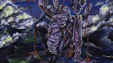
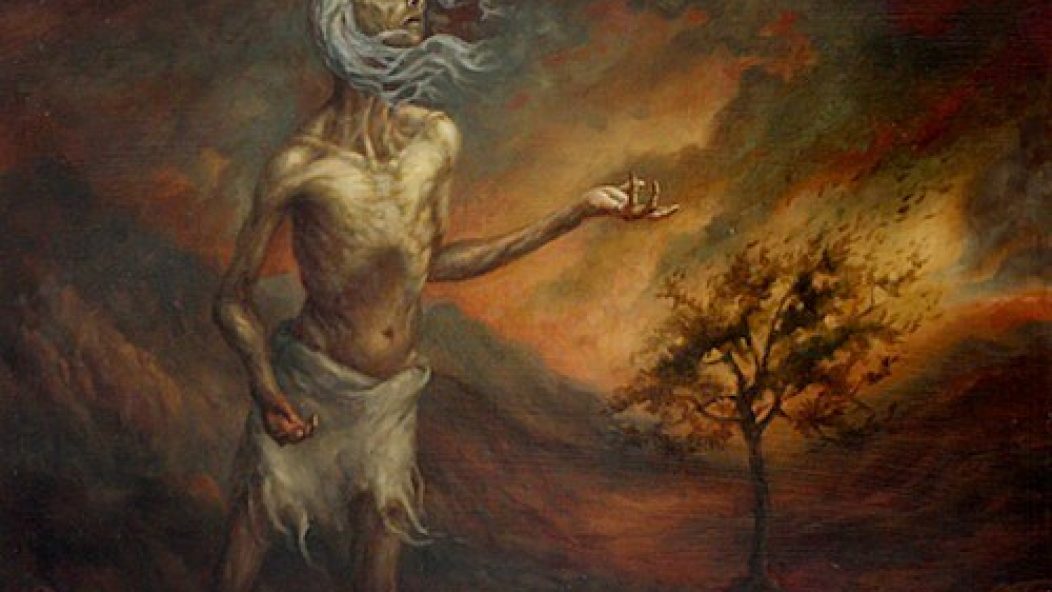
In one of the final pieces in the show, Michael Ryan’s “Lost Faith,” you see this bleak figure dressed in rags, holding up his hands. Maybe he’s raising them in supplication, but to me he looks like he’s playing air guitar. What do you think?
That is a piece from our permanent collection and it was one of the inspirational pieces for the show. It’s funny that you see the air guitar. We saw the same thing after we hung it for the show. Rock on!
")