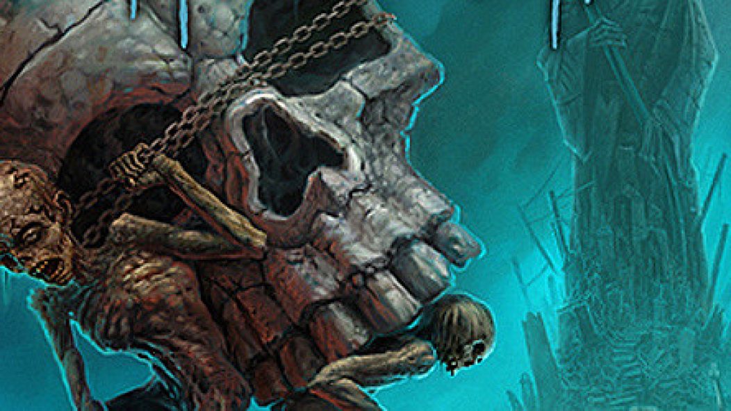
Autopsy's new album artwork
. . .
Metal now is both an audio glut and a visual drought. My inbox is a firehose of MP3s, but damned if I can get decent-sized, decent-looking artwork. “Send me artwork and lyrics”, I constantly beg labels. They send postage stamp-sized images, awkward text files (often individually for each song), and often nothing at all. I love reviewing incomplete digital representations of records, I really do. NOT!
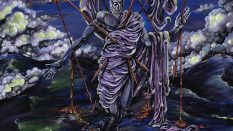
So Wes Benscoter’s album cover for Autopsy’s Macabre Eternal is a breath of fresh air. It’s the first album cover this year that’s made me return to it again and again. It reminds me a bit of Dan Seagrave’s cover for Landmine Marathon’s Sovereign Descent. The bluish fog (I’m probably getting the color wrong, as I’m sort of colorblind) is mesmerizing. It’s an interesting color choice. I associate Autopsy with red: Mental Funeral, Acts of the Unspeakable, the Fiend for Blood and The Tomb Within EPs. Red means heat, and Autopsy’s sound is hot: dirty and analog.
So here comes a cooler color, and a strong composition that divides the image in half. (Imagine a diagonal from the top left to the bottom right.) Benscoter creates depth by foregrounding the figure on the left, with all other figures receding into the distance. Add a big, vertical grim reaper in the back, and you have three axes of motion for a very dynamic composition. I love this image, and have stared at it with an unhealthy zeal. Too bad it’s only available so far in a small 472 x 472 size. (The scene in There’s Something About Mary where Ben Stiller’s character is whacking it to bra ads in the newspaper comes to mind.)
There really is no substitute for a good painting. I love design as much as anyone, but hand-drawn images unsullied by computers still reign supreme. Much like how I react viscerally (and badly) to plastic audio production, I’m allergic to Photoshop horrors. Art is like food; natural and organic is better. If you spend enough time on the Internet, your eyes become starved for organic imagery. Thank you, Wes Benscoter, for feeding our eyes so splendidly.
. . .
A TRIBUTE TO WES BENSCOTER
MY 5 FAVORITE ALBUM COVERS BY HIM
. . .
Ironically, if Wes Benscoter’s album covers were food, they’d be strange, cult favorites like broccoli rabe and durian fruit. His most famous album cover is probably Slayer’s Divine Intervention. But most of his other work is edgier. Benscoter’s trademark is discomfort. Peers like Dan Seagrave, Tony Koehl, and Vincent Locke come to mind. Benscoter likes the organic and the grotesque; his images don’t necessarily make for good t-shirts. Contrast with, say, Timo Ketola, whose images for Watain and Deathspell Omega are more conventionally “beautiful”. Benscoter doesn’t care about being tasteful. If he makes you queasy, he’s done his job. Below are my five favorite album covers by him.
. . .
5. Cattle Decapitation – Humanure
. . .
. . .
This is so disgusting, I love it. The Walmarts of the world didn’t take kindly to it, so it also appeared in an amusingly bowdlerized version.
. . .
4. Torture Killer – Swarm!
. . .
. . .
Whatever that background color is, it’s so pretty that one almost doesn’t notice what’s happening in the foreground. The more you look, the worse it gets.
. . .
3. Vehemence – Helping the World to See
. . .
. . .
There’s a bit of H.R. Giger in this, I think. As an aside, I saw Vehemence on one of the strangest tours ever, back in ’04. They, along with Dog Fashion Disco and All That Remains, opened for Prong. What???
. . .
2. Mortician – Domain of Death
. . .
. . .
This always leapt out at me from record store racks. And I never bought it, because it was always, like, $3.99 on clearance sale. To this day, I still haven’t heard this record. But I have a pretty good idea of what it sounds like.
. . .
1. Deceased – The Blueprints for Madness
. . .
. . .
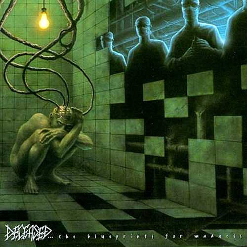
For me, this is the Wes Benscoter image. It’s dirty and subtly sinister, and gets more so the more you look at it. (For those of you who remember the Sega Genesis video game system, this image could totally be from one of its side-scrolling shooters. Those games always had a level set in laboratories filled with evil scientists.) I love how the text at the bottom balances the glow around the scientists up top. This album got pressed as a gatefold double LP, complete with brain-shaped insert. COOL!
. . .
