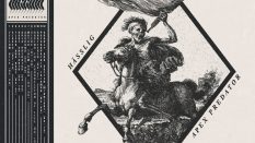
Anatomy of a Release, Pt. 3: Artwork

. . .
The series “Anatomy of a Release” will track the progress of a release from start to finish. Part 1 covered signing the band. Part 2 covered recording the album. In this third installment, Sean Crook, label head of The Path Less Traveled Records, talks about the process behind album artwork.
. . .
ANATOMY OF A RELEASE
PT. 3
ARTWORK
. . .
Greetings, fellow IO readers! I’m back for another post about what it takes to get music to the masses. Last time I left you, Kaliya had spent a couple thousand dollars on a recording and lost a couple band members, and we weren’t really sure what the hell was going to happen next.
Thankfully, they found two new members and have been rehearsing and getting the n00bs up to speed on the Kaliya material. To those who have never been in a band, this may seem like a simple task. To those of us who have been in bands, we know it’s not easy. Teaching the songs is usually the easy part. Making sure everyone is on the same page and the personalities gel is the hard part. It’s like having other committed relationships on top of a significant other.
. . .
In more exciting news, the art is pretty much done. How does it all begin? How much does it cost? Couldn’t I just print the inserts out on my own computer and make my own CDs for cheaper? A time may be coming where I go that route or something similar. As you’ll see, there’s a lot of thought, time, and sometimes money involved in getting art put together just right to represent the music. Follow me along on the journey that took about two months to complete.
The one constant no matter what format you are releasing (cassette, vinyl, CD, etc.) is that you need high resolution files and have them in a CMYK (ready for print) format. This is a key bit of information that will have your product looking top-notch (something I had no clue of when starting this label). The old and faded covers of old are great for ’80s death metal and underground slam bands. Some of us old folks would make our decision to purchase a cassette or record based on the cover alone, since we had no other way to know what was inside. I think this is even MORE important these days due to digital downloading. When an album is out a month or two in advance, and music is already in the hands of fans, you have to give them a reason to buy the physical product. Odds are, if you put out quality music and someone downloads it before the street date, if you have a nice presentation, they’ll still purchase your product. However, I’ll admit that metal fans tend to be more loyal then, say, a casual pop music listener. If there’s a market for 180gram Carrie Underwood vinyl, I haven’t seen it.
Being a label owner, I have little input on the art unless the band asks for my input. The one thing I do say is nothing pornographic or something overly political on the cover. It’s just not something that interests me and often times, if you have porn on the cover, some plants won’t even print it. As a label owner, I like to keep the respect of the businesses I work with, and like it or not, many printers will refuse to print porn. The political thing is just a personal preference. I find that about 3% – 5% of the population agrees with me politically, so if your band’s mission is to praise Democrats, Republicans, liberals, or conservatives, I’m not interested. Before signing a band, I usually know if they’re the type of band interested in that topic, so for me, it’s really a dead issue. Odds are, if you sign with a major label or even a smaller “independent” label, they’ll TELL you what the cover will look like and hire their own people to put it together and gladly take the cost out of your sales before you get paid a dime. You can toss in any other expense from any meal they take you to or even if you call them with a question. I’ve heard of labels treating their bands like clients and billing them down to the penny for EVERYTHING. Your artistic freedom usually stops when you sign the dotted line.
. . .

. . .
Kaliya tapped an artist named Luke Physioc to do the front cover drawing. Luke is a great artist and is currently stationed in Afghanistan. I met him at Dudefest in Indianapolis a few years back (this is an underground metal show; get your mind out of the gutter). Most covers start with the band and artist exchanging ideas. This could be an overall theme of the lyrics, a certain mood, or it could just be something dark and evil that has nothing to do with the music at all. It’s really up to the artist and the band to do what they think is cool. Here’s what Luke and Ben (guitarist) had to say on their thoughts behind the art:
Ben:
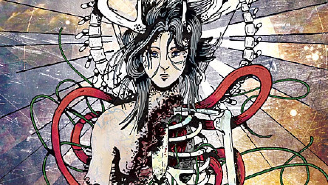
I will let Luke do most of the feedback on the foundation of the artwork and inspiration, etc. But basically I saw some of the stuff Luke had done and thought that it was really cool. I had met Luke before, so he was already an acquaintance, so I thought it would be cool if he did our art as well. Basically I showed his stuff to the rest of the band, and everyone else really dug his stuff as well. Luke and I kind of tossed ideas back and forth on what we were going for, and we wanted something that might depict the Annihilator as a being of some sort. Originally we were thinking mechanical with cannons for arms, chainsaws, that type of stuff. Eventually we went in a little different direction. Everyone in the band really seemed to love his piece “0 Gravity Girl”. So if everyone loved it so much, why not just do something similar to that? So basically we came up with some changes to that piece to make it our own. Luke did an excellent job on the foundation of the artwork, and I really think Mike (Kaliya drummer) brought it to life with the color that he used. It ended up a little different than most metal albums with as much color that is presented in it, which, in a way, is kind of cool, I think.
Luke:
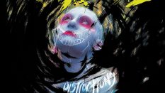
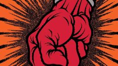
I’ve known both Sean and Ben for a little while now. All of them post on the Decibel Magazine forum, and I think we were all sort of a fan of each other’s stuff. I was the last one to the party because I am completely clueless about starting blogs and posting things online, but my wife is a computer wizard and set up a very nice little website for me to basically show some art off for some friends. Sean started putting out some good records, and I live a little ways away from Ben and knew about Kaliya. Ben and I hung out at a few shows and became friends, and when I started posting my art, he approached me with doing the art for their upcoming album Annihilator. We talked for awhile about how the annihilator would be this machine loaded down with weapons. I immediately started getting ideas of the post-apocalyptic worlds of the Terminator and Mad Max movies. I don’t like shiny things; I like things to look beat up, rusty, old, and mean. It was a cool idea and very outside the realm of what I normally draw (my wife jokingly refers to my niche being “disfigured women”). But after Ben and the band checked out my art, they all liked a piece I did called 0GravGirl. 0GravGirl is kind of an amalgamation of my influences. I grew up admiring Pushead’s art on Metallica covers and Zorlac skateboards. No one will ever make a skull look as cool as he does. But you can’t have the sour without the sweet, and I also really dig Alphonse Mucha‘s pretty girls. I am pretty much the standard cliché going in music art right now, thanks to the popularity of Florian Bertmer and John Dyer Baizley, but that’s cool. Those dudes are also very big influences of mine, and their attention to detail is just amazing. Maybe it’s a generational thing, too; we all grew up liking Pushead and comic books or something.
Anyways, 0GravGirl was drawn after I was up too late watching the crappy fourth Alien movie, and the ending with the Alien getting sucked out of the spaceship got me to thinking about what a person would look like exploding in space. It sounds incredibly morbid when I say it out loud, but that’s the story. So I drew this pretty girl with her hair looking like it was underwater (another thing I like to draw) and basically drew her from chest down exploding in zero gravity. I didn’t draw any blood, but there are just veins and bones and tendrils all over the place. Kinda gross, but pretty clean as well. My mom always tells me that she thinks my art is pretty until she really starts looking at the details. I kinda like that – pretty surface, decayed interior.
Ben told me there was a change of plans, and that they wanted something similar to 0GravGirl, only they wanted her to have an ouroboros incorporated into it, and they wanted her to have antlers. They also wanted there to be an all-seeing eye, but I couldn’t make that work too much, but the light rays turned out kind of cool. I drew up some initial sketches, and after the band was psyched on it, I sent it off. Their drummer did all the colors online because they had their own plan for that, and I think the colors he used are just amazing and really made the drawing come to life.
For materials, I am pretty simple. I just used the Faber-Castell Pitt Artists’ Pens on an 80 lb. sheet of regular paper. I have the Rapidographs and some other fine pens, but sometimes you get some really nice results out of just using a Sharpie. And as for paper, I am pretty satisfied, as long as it’s about 80 lbs. I wish it sounded fancier, but that’s my bare-bones setup, and it works a lot.
I really enjoyed drawing the piece and seeing it come to life for a band I like on a label I like. I’ve been really lucky so far to work with really cool bands that allow me to have freedom and yet still give good guidelines.
After a few rough drafts and going back and forth with the band, this is what the base of the cover looked like:
. . .

. . .
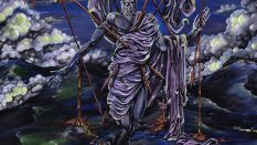
After Kaliya’s drummer added color, this is the outcome:
. . .

. . .
As you can see up top, the colors are a theme throughout the packaging, which is always nice. No one likes to buy a CD with a certain themed cover, only to open it and none of the art flows with the cover. Either that’s the case, or I’m just anal. I try to work with bands that take pride in the package and care as much about it as I do. I remember when I put together the Flourishing CD (review); the band was looking for a certain type of paper. It took a bit to get it right, but I’m glad we went that route. For the 150 or so of you that bought the CD, you know what I’m talking about.
What’s next is getting someone to put the art into the proper templates. Luckily I know someone that does this in exchange for a free copy of the CD. I try not to set release dates too soon, due to the fact that shit happens. We fucked up the art, misspelled a word, the printer fucks up the CDs, I run out of money, etc. I try to give myself a little buffer. The main reason is if I miss my deadline with the distributor, I am fined $400. I can get into those specifics next time where you’ll see who gets all the money from a $12.99 CD, and how it all adds up.
Thanks again for reading, and I look forward to reading your comments!
The Path Less Traveled Records
. . .
KALIYA LINKS
MySpace
Facebook
The Path Less Traveled Records
. . .
LUKE PHYSIOC
. . .