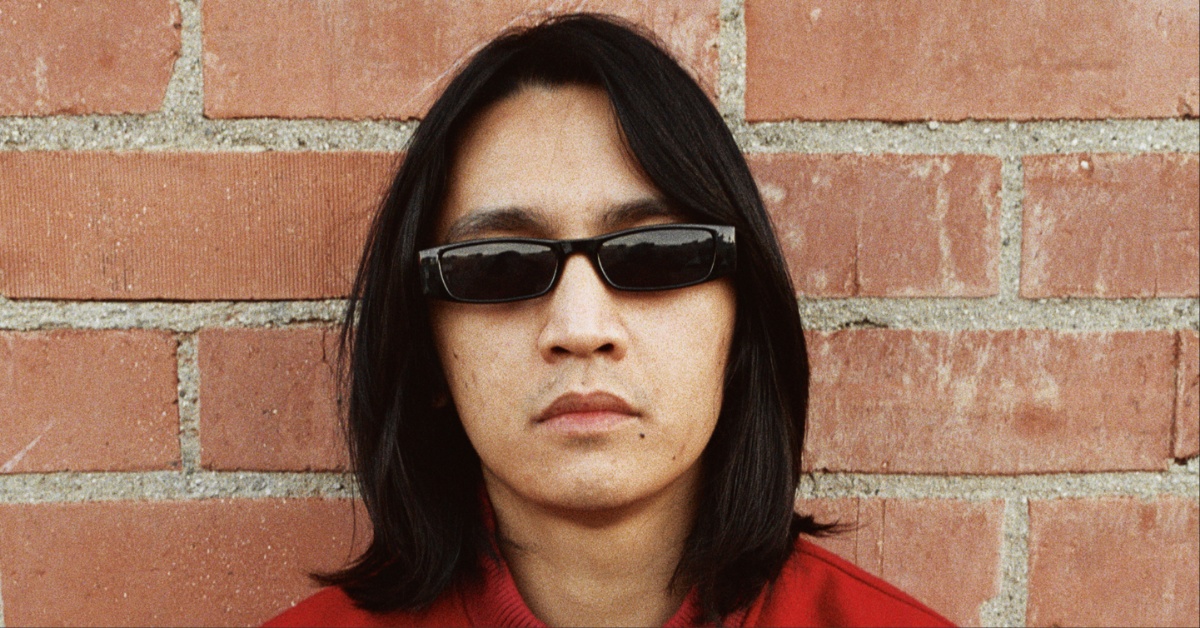
Interview: Andrei Bouzikov

Cannabis Corpse – Beneath Grow Lights Thou Shalt Rise
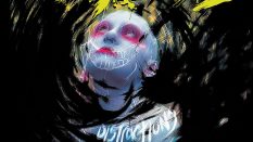
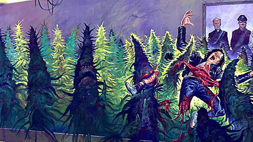
Cover artwork by Andrei Bouzikov
. . .
Andrei Bouzikov isn’t a metal household name yet, but he’s fast becoming one. He’s done bold, beautiful artwork for Municipal Waste, Autopsy, Skeletonwitch, and many more bands. Bouzikov grew up in Belarus and moved to the US at age 16. He went to school for art, dropped out to work professionally, and now lives in San Francisco. I asked him via email about his artwork for the new Cannabis Corpse album, Beneath Grow Lights Thou Shalt Rise (see above; it comes out July 12 on Tankcrimes), and other records.
. . .
Walk us through the process behind the artwork for the new Cannabis Corpse album.
Landphil approached me to do another record cover right after The Weeding EP about a year ago. After a month of going back and forth between two different concepts and sketches, we finally agreed on the weed plants ripping unfortunate metal fans to pieces. The painting was finally done, but there was a space left in the upper/mid-right section, and Landphil suggested we plant evil politicians staring through the window. I liked that we added the evil politicians because it gave a different meaning to the concept.
How does a kid from Belarus get into metal?
When I was 14 or 15, I was walking home from school with some friends, and we noticed a flyer which had a skull in a German WWII helmet painted on it. Because it was done so well, I and my friends stopped by to inspect it closer, just to find out it was a bill for a local metal gig. We didn’t go to the show but started to investigate what this “metal thing” was all about. Music in the ex-Soviet Union sucked very badly; it still does. Western music, movies, and books were a window to a different life for us and also an escape from our grim reality. We would listen to any rock/punk/metal music we could get our hands on. I still have a Polish bootleg Metallica tape with a front title Jumping in the Fire.
What were the first visuals that sparked your imagination?
My family were art educators, and they had an extensive collection of WWII propaganda books, German expressionists books, art books, war photo books, humor magazines, etc. Books, memories, and surroundings that I grew up in help me a lot with my inspiration.
You studied art formally. Did that actually help? What did your instructors think of your work?
I studied on and off since I was 12. And because all of my family were artists, I though it would come naturally to me when I grew up, so I took a very lazy approach to my education. As a kid, I would skip classes, burn my homework assignments, etc. When I was 20 and that art knowledge didn’t appear – that’s when I became nervous that I would end up getting stuck working in my job at the time at Boston Market in NYC.
I went to San Francisco and enrolled into the Academy of Art and approached my classes at first in a fairly lazy way – too much drinking and chasing girls. The school stuck it out with me (they needed my $). As a result, I learned a lot. Besides being ridiculously expensive, school helped me a lot. The illustration department was fantastic. It was run by some very good illustrators/artists. Except for a few pretentious students, it was an overall awesome experience. I learned a lot, and it helped me to figure out where I stand as an artist. Instructors liked my work and featured some of it in a few student art shows. I even received some awards for it. It was no bummer.
One time as a joke, I drew a Jesus on the cross and a soldier shooting a gun at him. I showed it to my Mormon school friend; he was a good artist. He looked at it, turned red, and whispered to me, “NEVER DRAW THIS AGAIN”. At the end of a semester, he wrote me a note that said, “Draw something lighthearted for once”.
. . .
Let me guess – Ed Repka is a big influence on you. But I also see other influences like Pushead and Frank Frazetta and vintage comics. Do you consciously switch between these modes, or are you more like, “Whatever comes out comes out?”
Yes! I love those guys, I grew up looking at Megadeth covers and Pushead’s Metallica skull, and I had a Frazetta poster in my bedroom. When I paint, I don’t try to imitate specific styles but try to figure out what color scheme would go nicely with a band’s music and aesthetic, and the rest comes out naturally. It’s kind of like Kandinsky theory – each sound is represented by a color. Before I take a job, I try to listen to the band’s tunes and find out what colors and images would come to mind.
Repka had a huge impact on me. I also look at the guys that they liked: pulp covers, Basil Gogos, and pen-and-ink guys from the early 20th century.
Your methods include paintings, pen and ink, and “illustrations”. What do illustrations involve? Do you prefer any specific media?
Acrylics work the best for me. I am also very fond of oil paints, but don’t use those so much; they take too long to dry. I like traditional mediums. It’s more glorious! Computer and Wacom pad don’t feel the same.
As an artist, what are your weaknesses?
Promotion – it’s hard to stay on the computer for a long time.
As an artist, what are your strengths?
I can keep up with deadlines.
Would you work for lame bands if the money were right?
It depends. If I get “cooler” work as a result in the long run, then, yes, at the end of the day I have to pay rent and my bills. To me, the expression “lame bands” I associate with Jonas Brothers or a Christian rock band. I don’t think I have to worry about them hiring me, anyway.
How important is humor to your work? Even your most brutal work seems to have a black humor to it.
I have to entertain myself somehow.
. . .

. . .
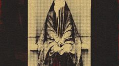
This has an older feel to it. Did you have any specific influences in mind?
Frazetta’s ’60s type of stuff. When I hear “crypt”, morbid colors, spider webs, and Vincent Price movies come to mind. Autopsy had the concept in mind. As soon as they told me, it just popped in my mind: three figures right next to each other. When I think of a cover, I imagine basic shapes and colors – think Russian constructivism – and the rest goes from there.
. . .

. . .
How did you come to work with a black metal band? Black metal is not a big part of your portfolio.
I worked with Nuclear War Now! records on the Nocturnal Graves release prior to Denouncement Pyre. I believe they share the same band member. That’s how they ended up hiring me.
I wish black metal bands would hire me more. I would love to expand my portfolio. Plus, I like monochromatic color schemes, too.
. . .

. . .
Is this your Ed Repka influence coming through? Metal album covers didn’t really portray cities like this after the ’80s.
Hellmouth asked me to work with those particular colors, blue and yellow. I wanted to make it more dramatic by breaking perspective and placing buildings in such a way. I didn’t look at Repka when I worked on Hellmouth at that time. I just took a photo of myself and my wife and took off from that point.
. . .

. . .
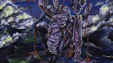
This seems like more Repka influence. The preacher reminds me of that on the cover for Ghost’s new album. Or is it just that all popes are evil?
Popes are evil pervs, politicians are murderous maniacs, doctors are sadists, goats and nuns make love to each other.
. . .

. . .
Does intoxication play a role in your work process?
I only get high if I am close enough to a paint thinner.
. . .
ANDREI BOUZIKOV
Portfolio
Blog (includes current work)
. . .